
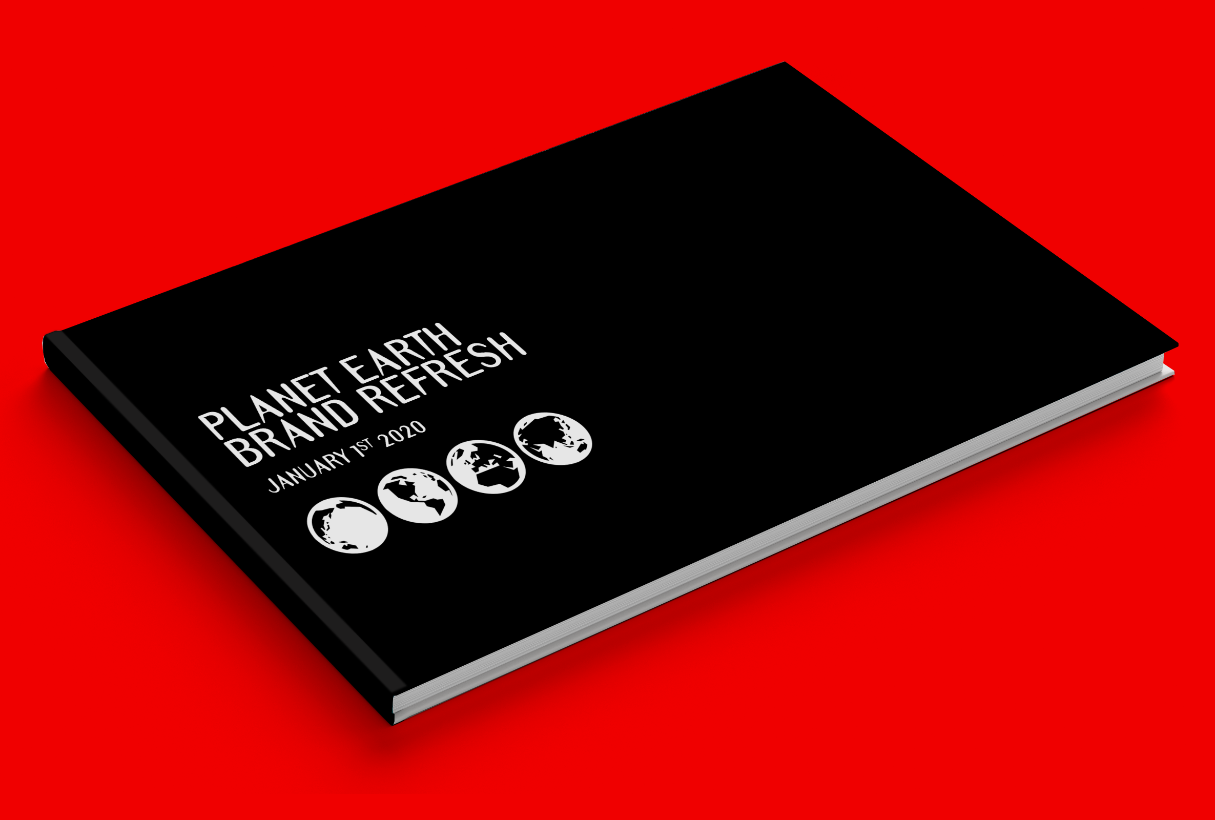
Planet Earth Brand Refresh
At the dawn of a new decade, fresh thinking is required.

Strictly non confidential.
Copyright unreserved.
Please distribute freely.

01 : THE BRAND CHALLENGE
Planet Earth is a dynamic, 360 degree, always-on, family orientated, global enterprise.
In recent times, however, the Planet Earth brand has suffered woeful neglect and chronic underinvestment resulting in a rapid dip in performance and decline in brand love.
At the dawn of a new decade, fresh thinking is required.
The challenge is to re-imagine Planet Earth as a more future-centric brand, restoring it to its rightful position as the No.1 desired and admired brand in the Universe.
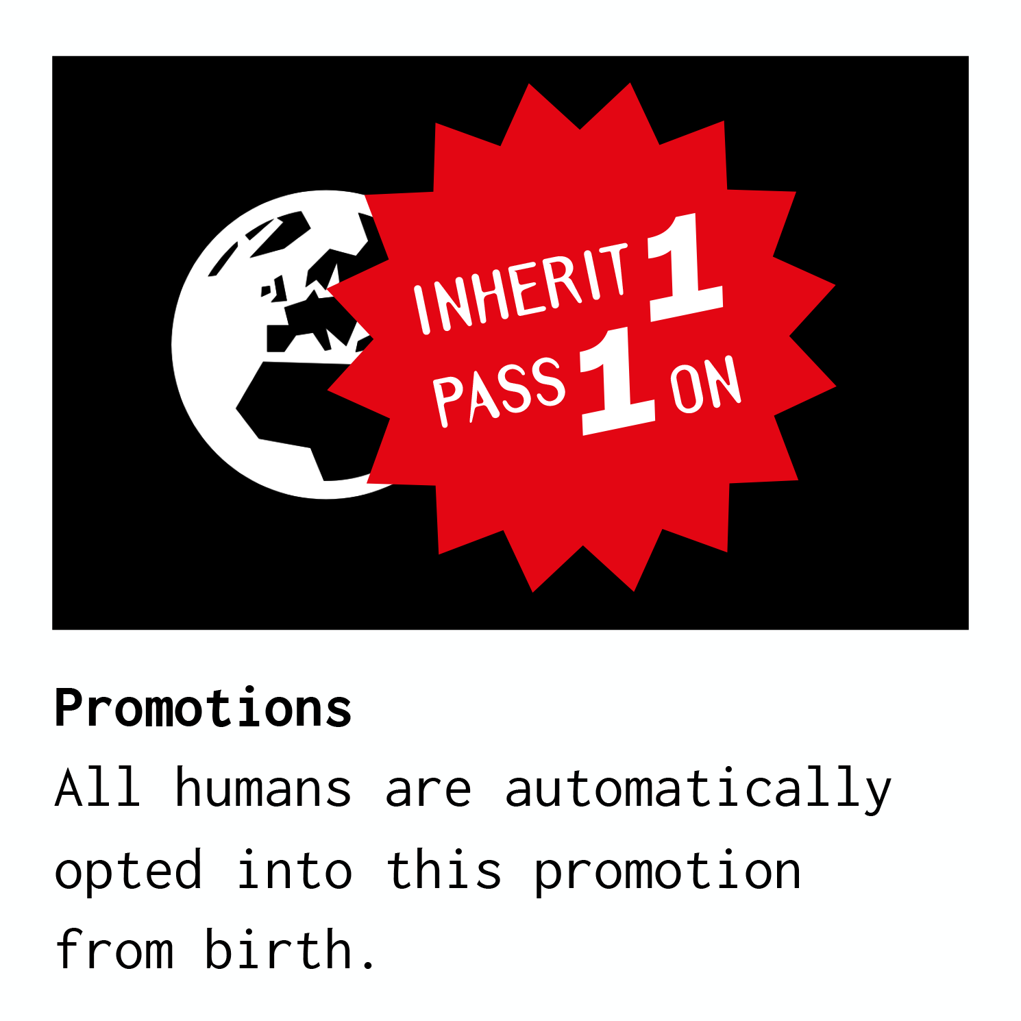
This document provides an overview of the brand refresh, along with instructions for activating the brand to achieve maximum return for all key stakeholders*.
*Key Stakeholders: Trees, Leaves, Birds and Bees, Fleas, Peas, The Seven Seas, Cats and Dogs, Bats and Frogs, Four legged creatures, All-legged creatures, Deserts, Jungles, Volcanoes, Beaches, Rivers, Icebergs, Mangoes, Peaches, Earth, Wind, Fire and Shrubs, Grass, Mud, Bugs and Slugs, Mountains, Meadows, Lakes, Rainbows, The Ozone Layer, Tomatoes, Potatoes, Big kids, Small kids, Sisters, Bros, Reptiles, Insects, Camels’ toes, Fish, Birds, Clouds, Crustaceans, You, Your Mama and Future generations. To name but a few. Please ensure all key stakeholders are consulted in a timely manner and approve all future activity.

02 : BRAND POSITIONING
Extensive research indicates:
a) Limited opportunity to shift brand position in the market.
b) Ample opportunity to flourish in the current position.
The strategy therefore is to consolidate and strengthen the current brand positioning through collaboration, innovation and shedloads of optimism.

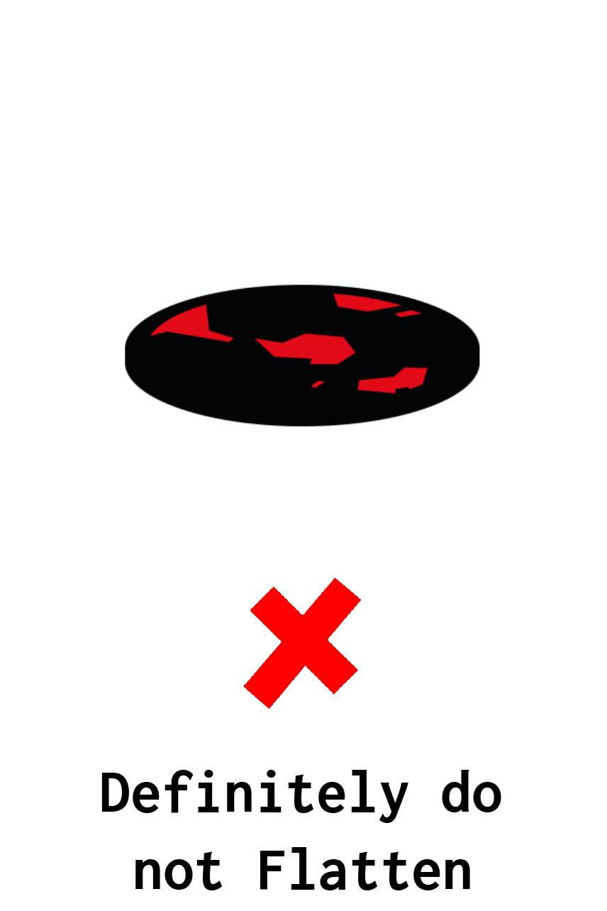
Not to scale.

03 : A BRAND SPANKING NEW brand MANIFESTO*
We’re not lovin’ it.
Things aren’t finger lickin’ good.
The future’s not bright, the future’s frightening.
It’s time to think different.
To find solutions for a smart planet.
And forget the idea that good things come to those who wait.
Let’s believe in the power of dreams.
That impossible is nothing.
That once you pop you can stop.
Let’s embrace real beauty and taste the rainbow.
Let’s say it with flowers (and trees).
Because we’re worth it and so are future generations.
This is the real thing.
Don’t think small.
Just do it.
Let’s make Planet Earth great again.
*Probably the best brand manifesto in the world.

04 : LOGO USAGE
Our logo is our most valuable brand asset.
It’s steeped in heritage having been meticulously crafted over countless millennia.
It achieves instant universal recognition and is designed to illicit the warm, comforting emotion of home sweet home.
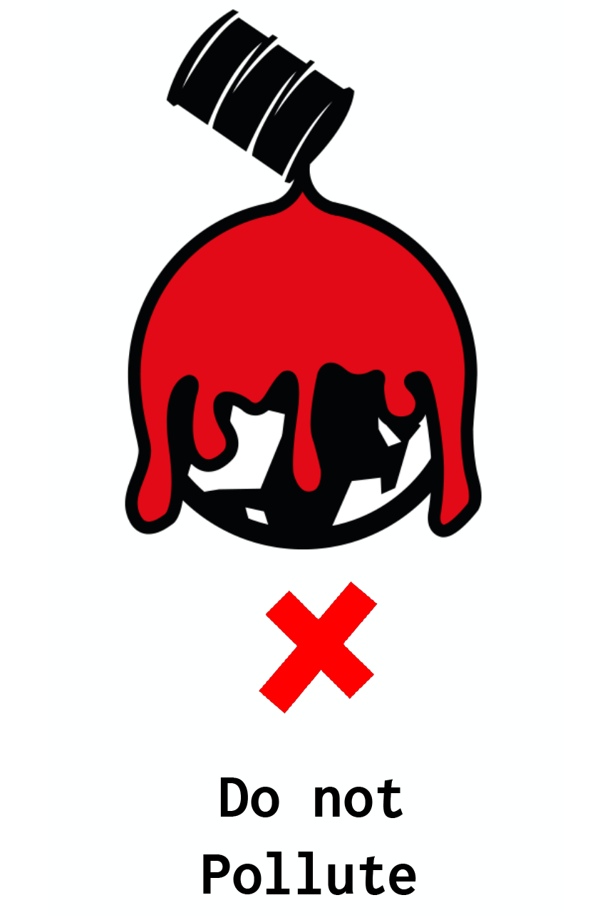
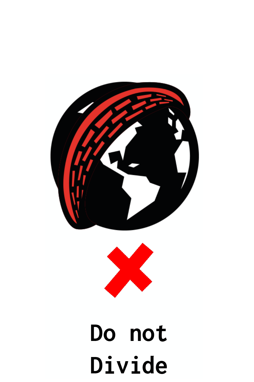
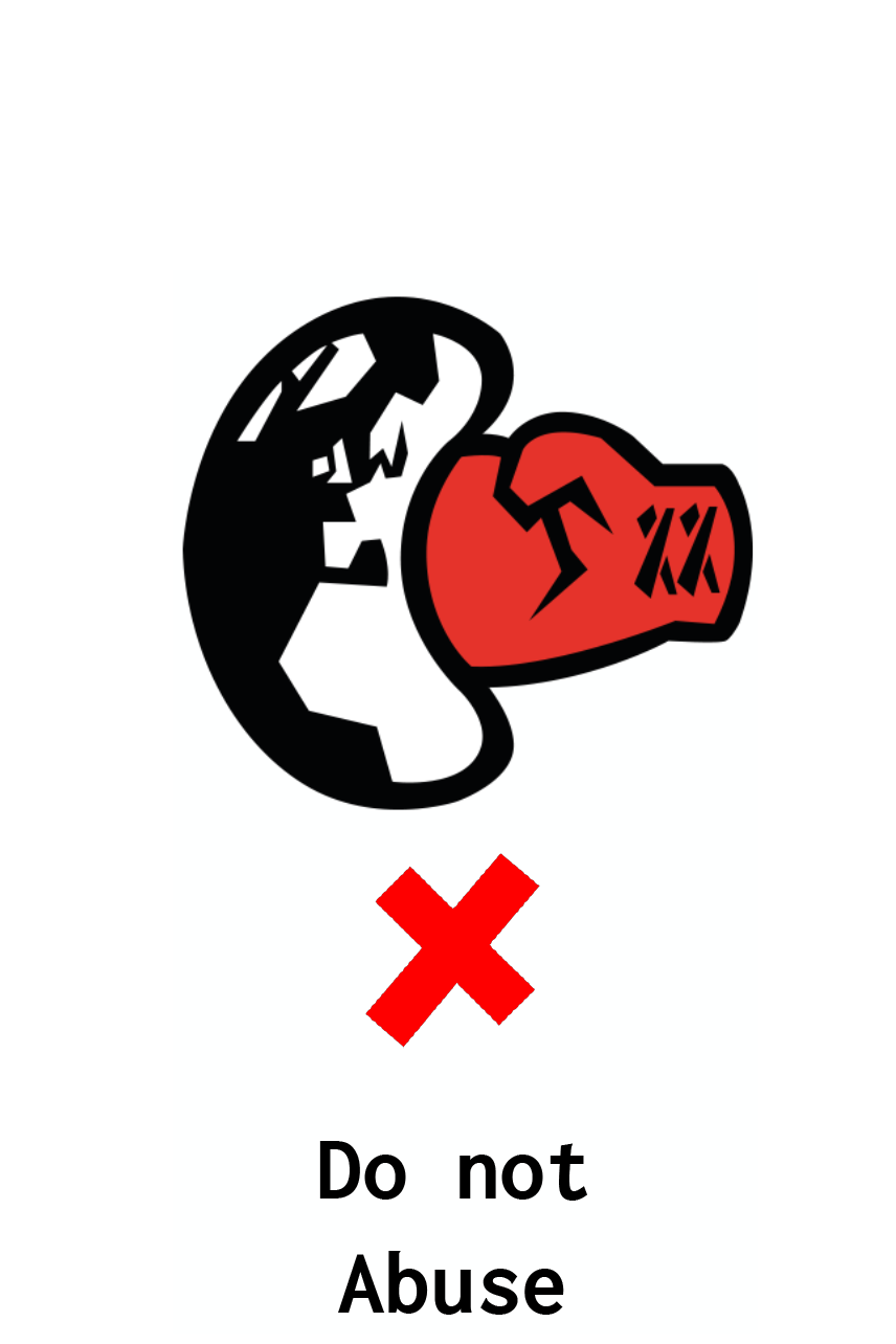
*** PAY SPECIAL ATTENTION: COUNTLESS INSTANCES OF SERIOUS LOGO MISUSE HAVE BEEN REPORTED. ***

05 : UPDATED BRAND COLOURS
All colours are created equally.


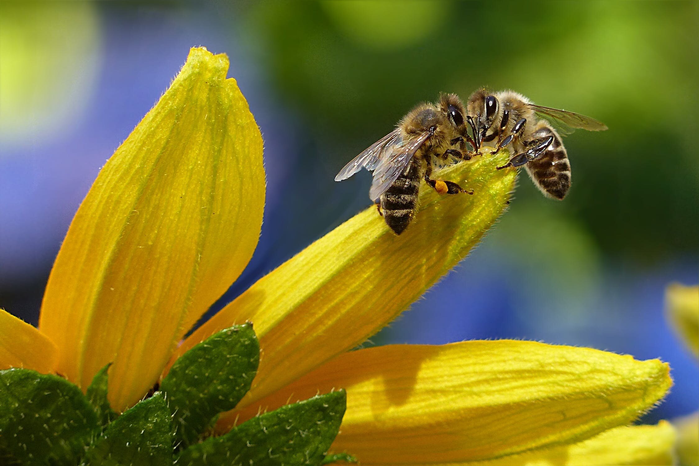
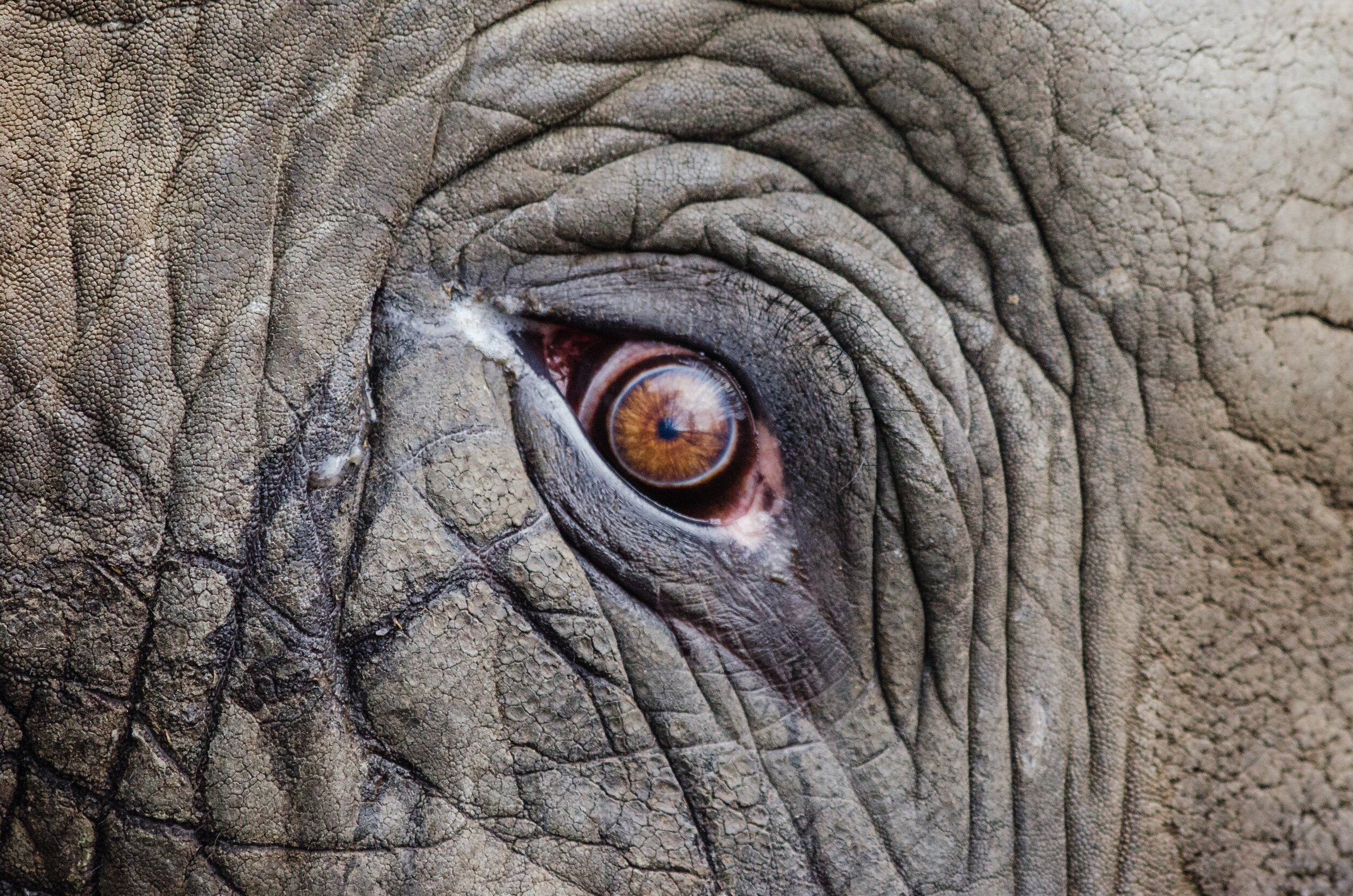
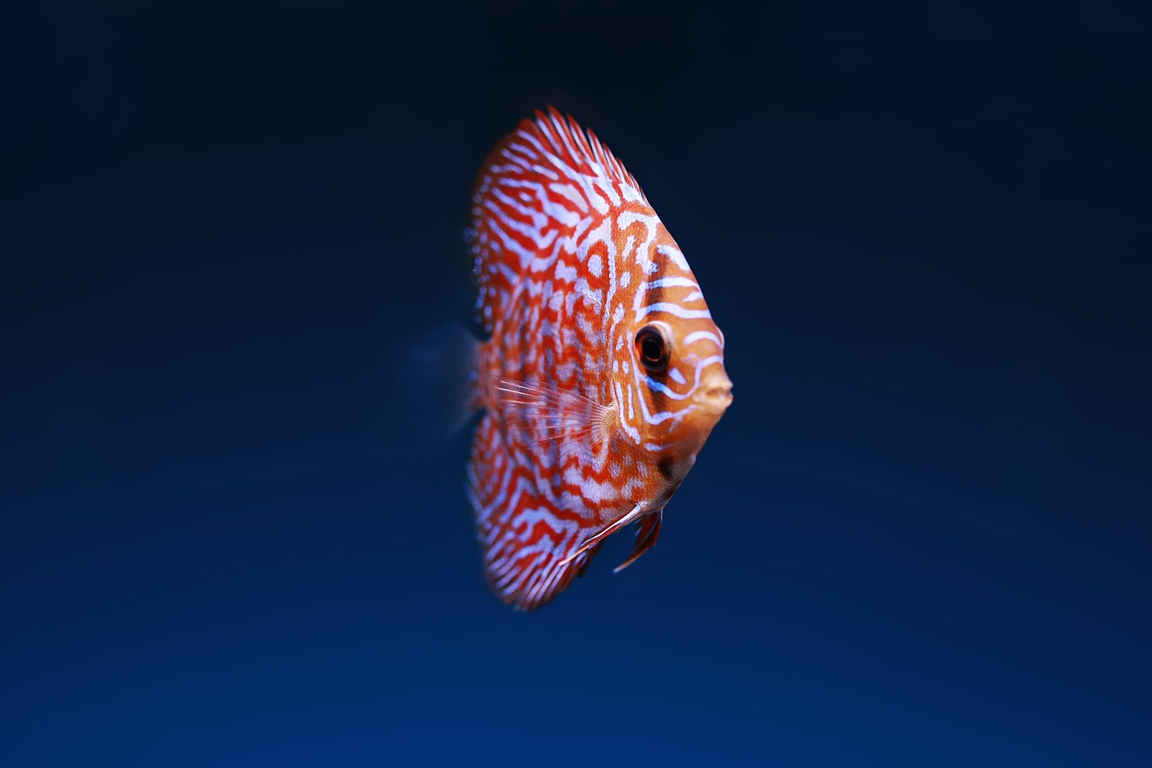
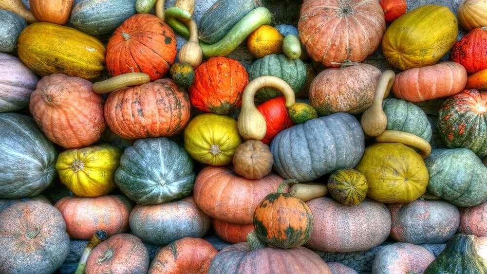
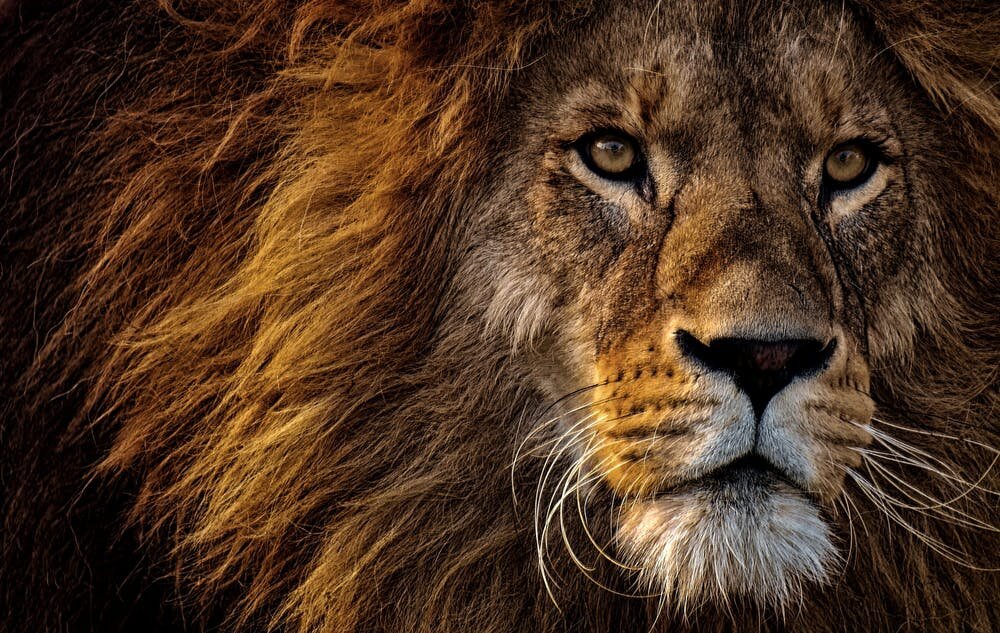
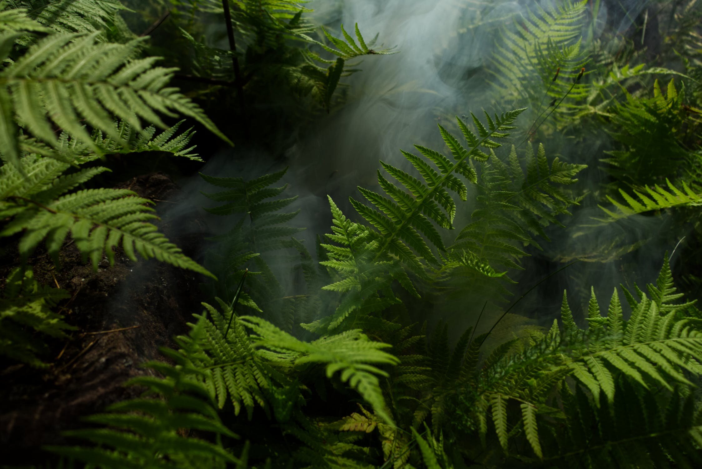
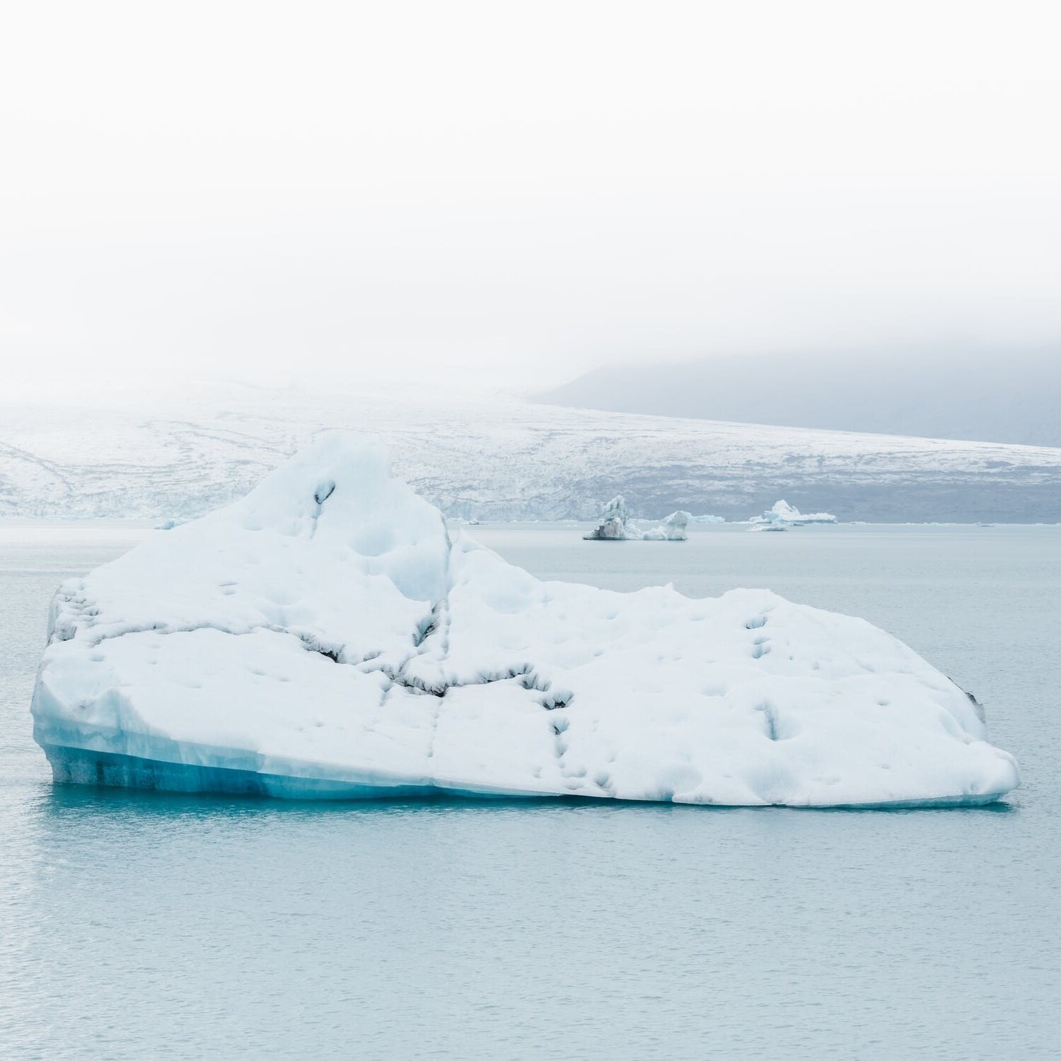
06 : BRAND IMAGERY
Since the dawn of time an extensive library of brand imagery has evolved.
Please utilise all assets wisely and handle with utmost care.
The examples shown are just the tip of the iceberg…
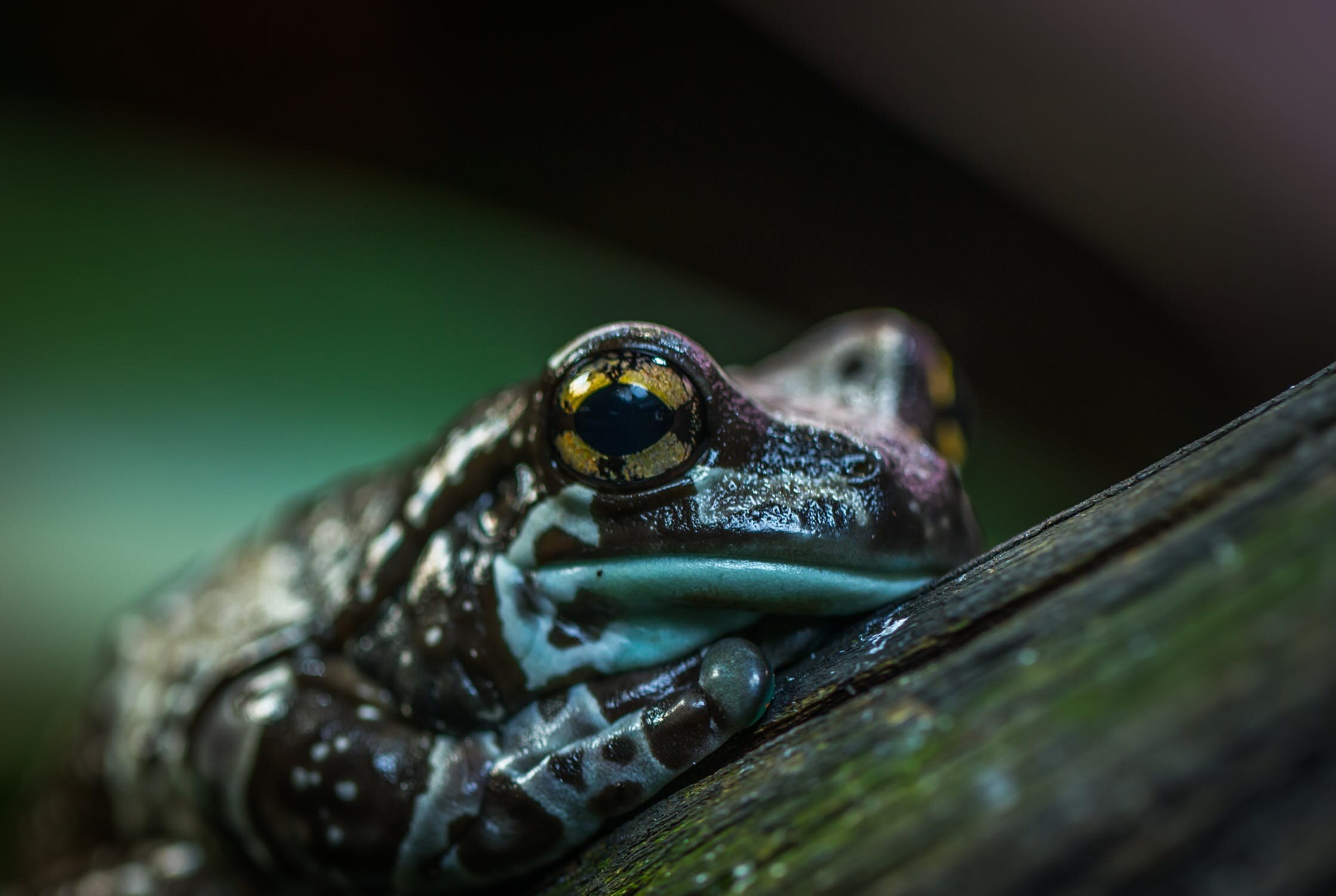

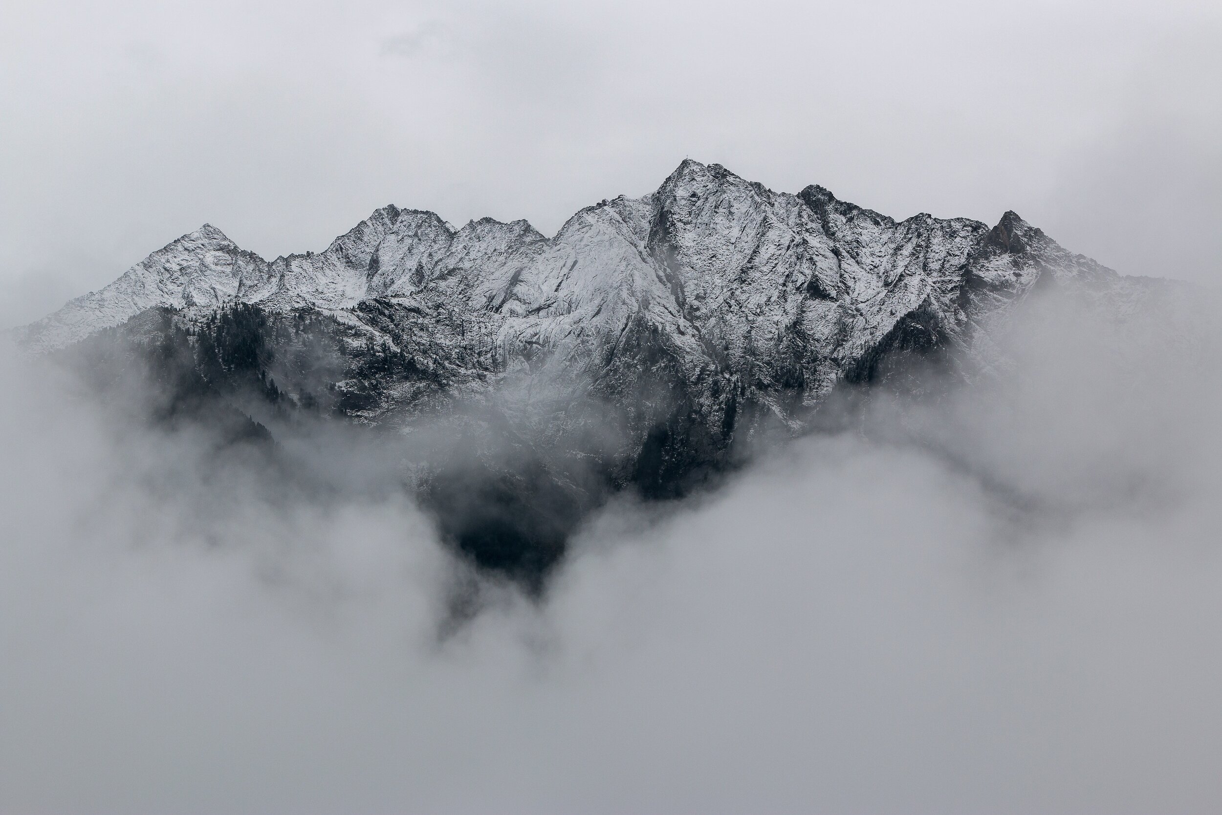
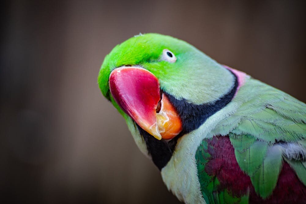
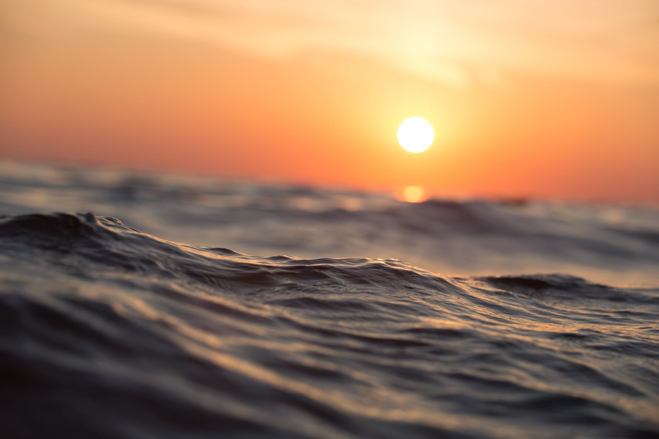


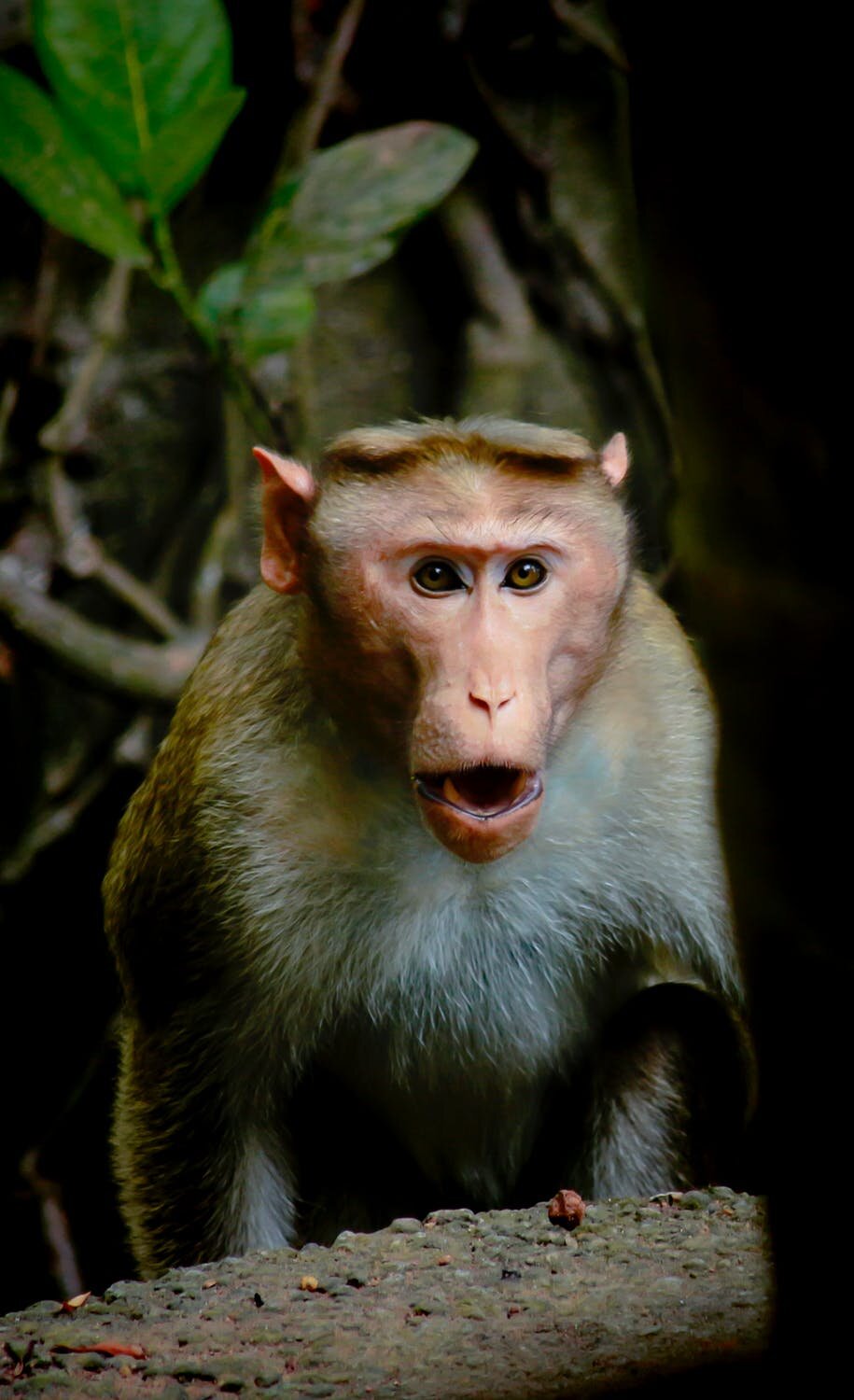

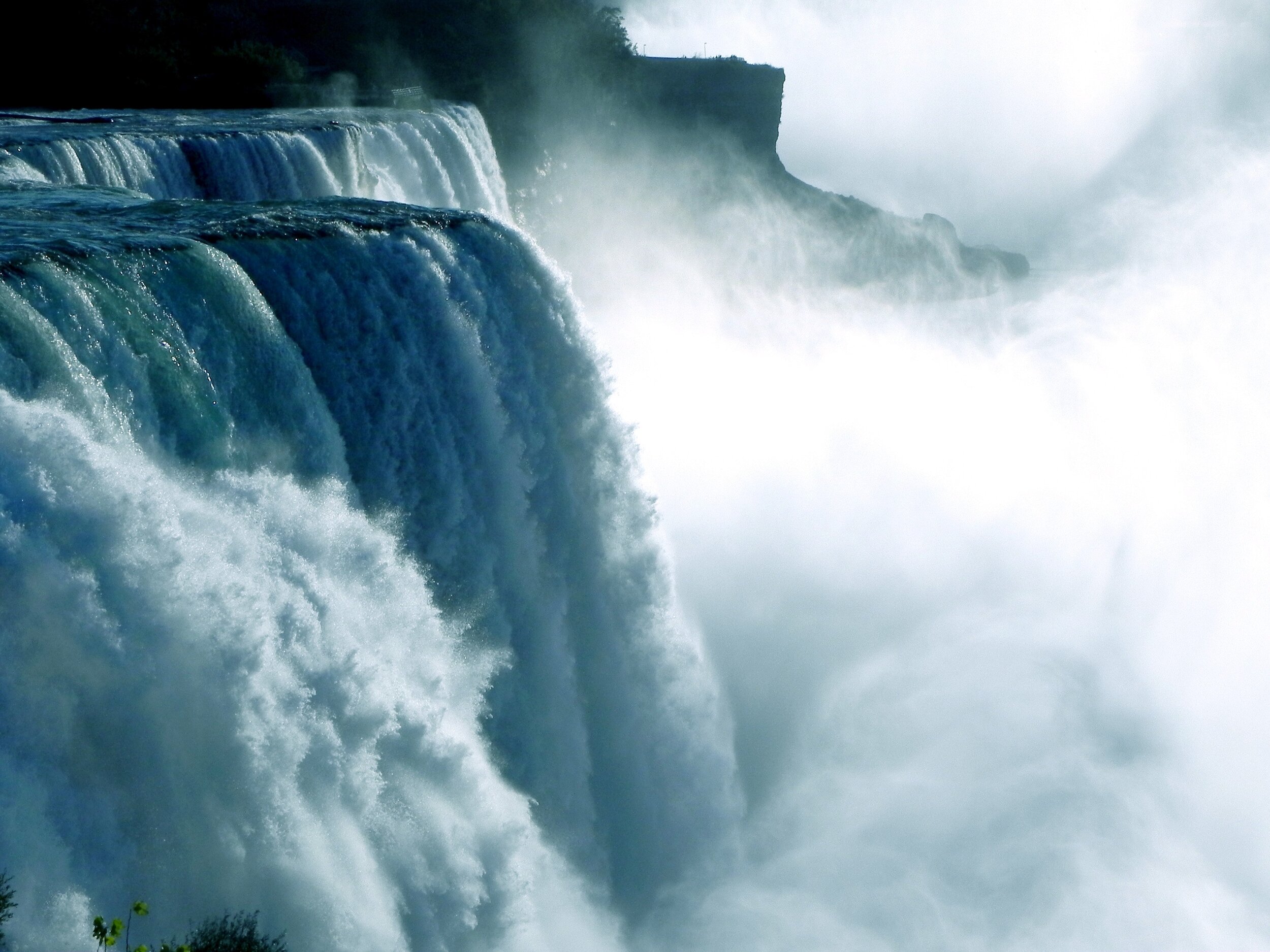

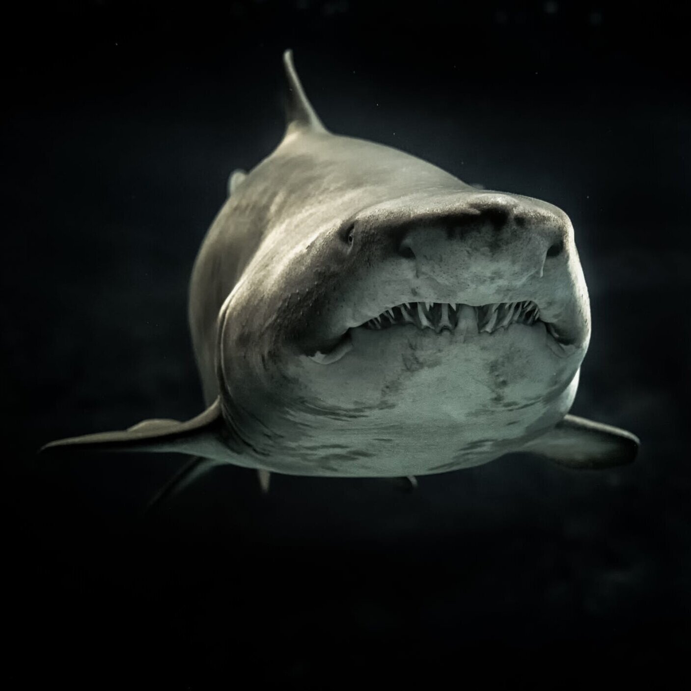

Etc, etc, etc.
All examples spotted in their natural habitat pexels.com.

07 : TONE OF VOICE
Human.
To enrich your communications please embrace synonyms: compassionate, humane, kind, kindly, kind-hearted, considerate, understanding, sympathetic, tolerant, approachable, accessible.

Please note: Human in the sense of 'Showing the better qualities of humankind, such as kindness’ not ‘Humans destroying the planet'.

08 : DESIGN LAYOUT GUIDELINES


Nothing additional to add here.

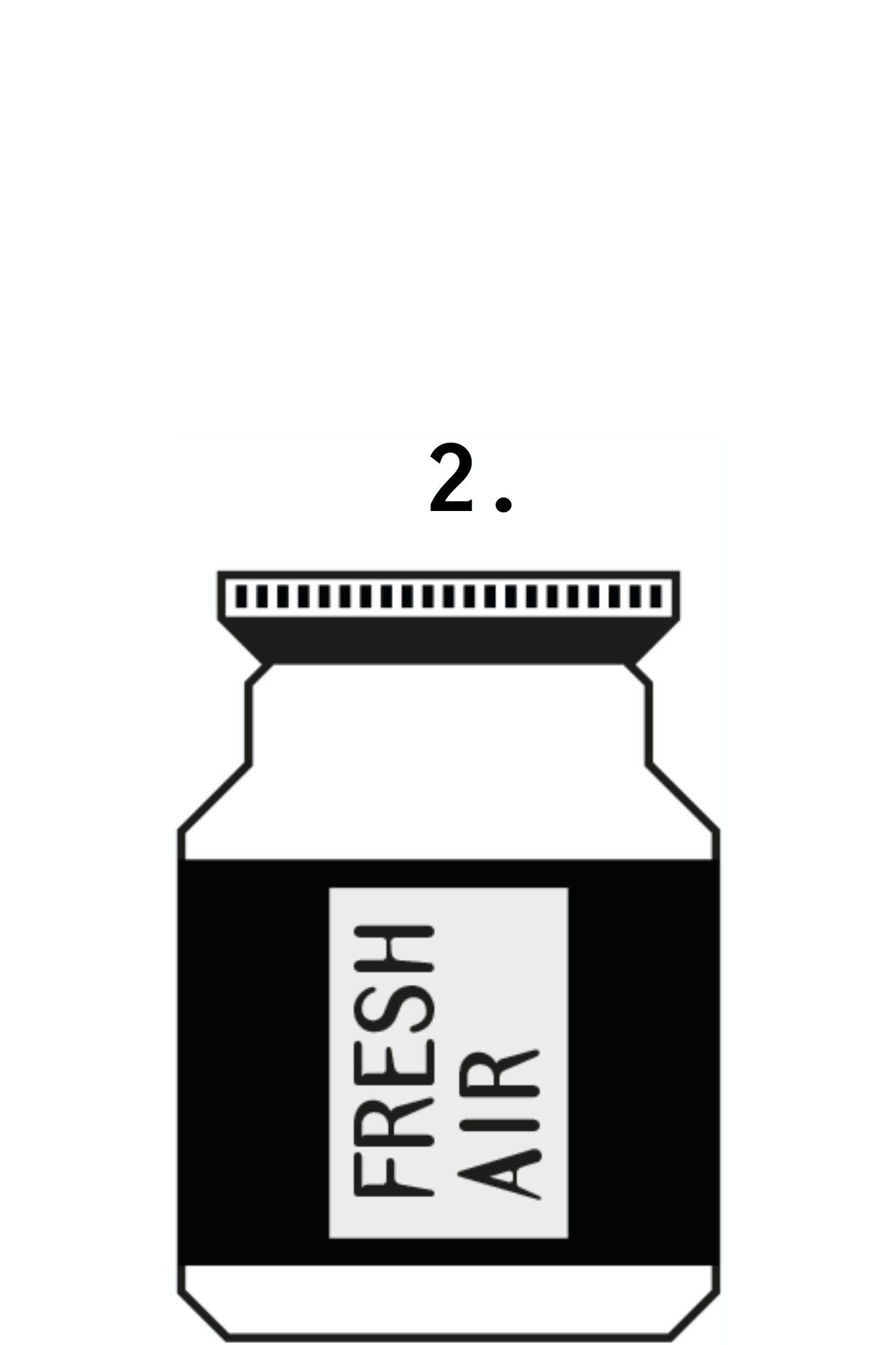
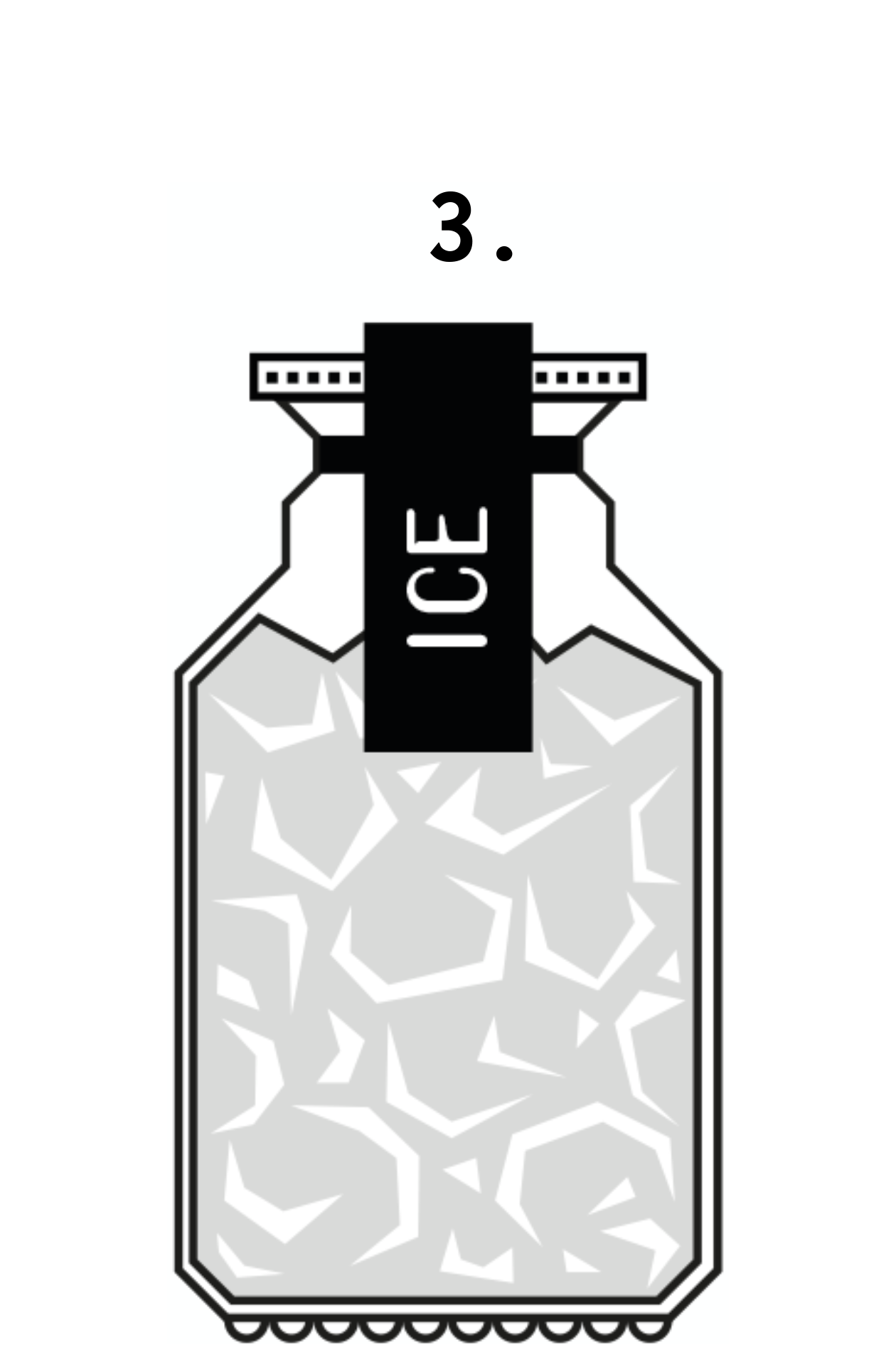
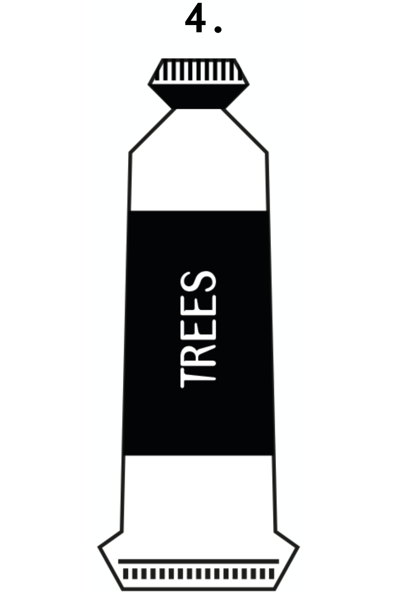
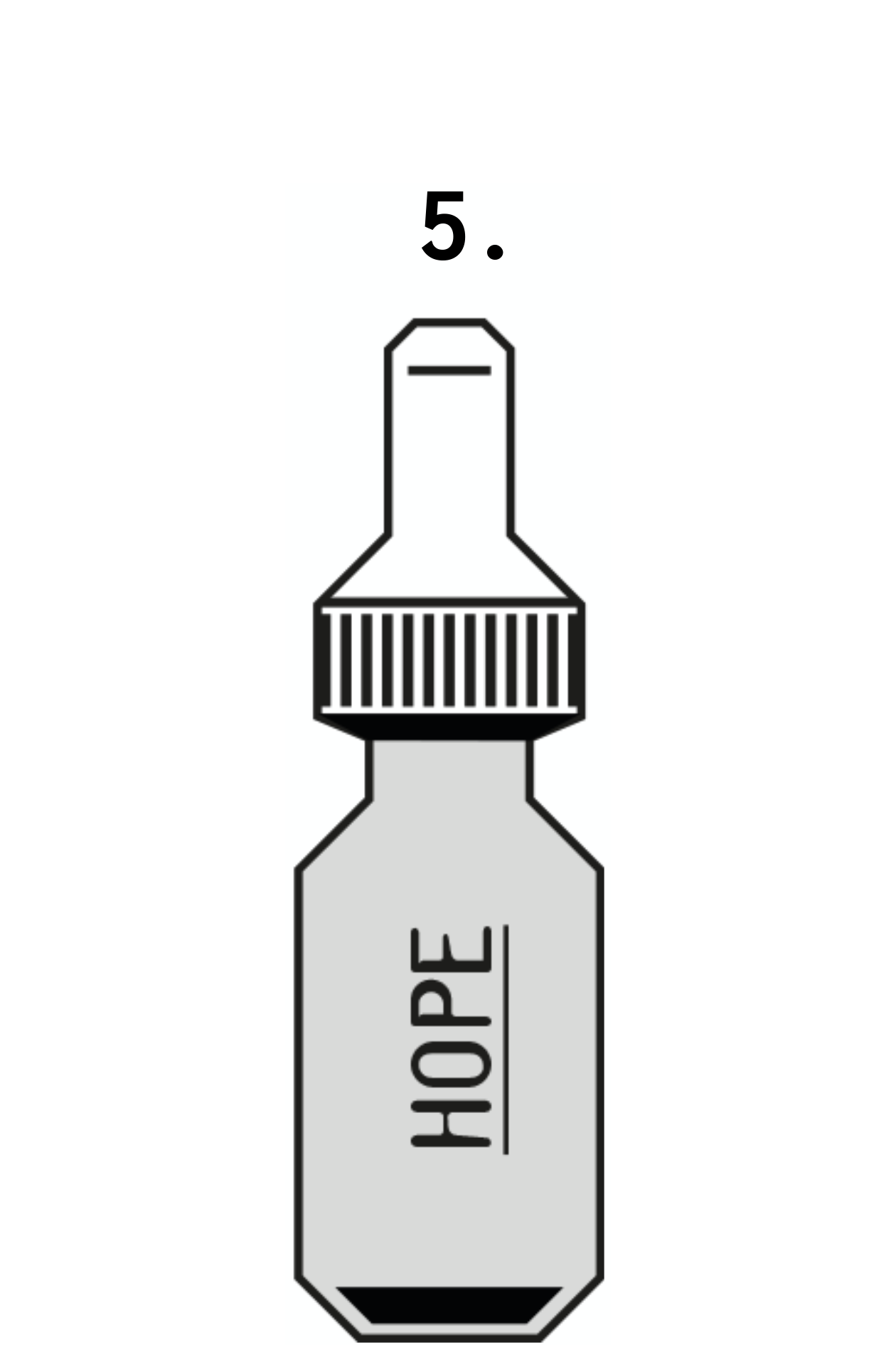
09 : PRODUCT STRATEGY
The following products have been identified as critical to brand success, therefore please promote enthusiastically across all communications.
1. Clean Water. Global audiences have literally lapped it up since launch.
2. Fresh Air. Putting the ‘life’ into life since life began.
3. Ice. Any self respecting polar cap wouldn’t be seen dead without it.
4. Trees. Coming back into fashion like there’s maybe no tomorrow.
5. Hope. The 2020s’ simply must have accessory.
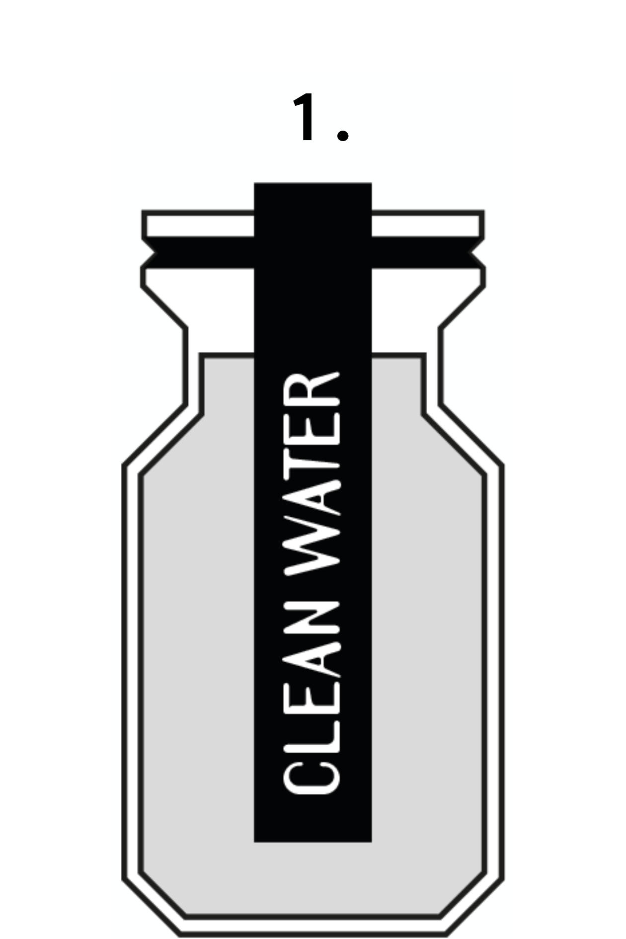
Packaging is for illustrative purposes only.
These are plastic free, zero waste products.

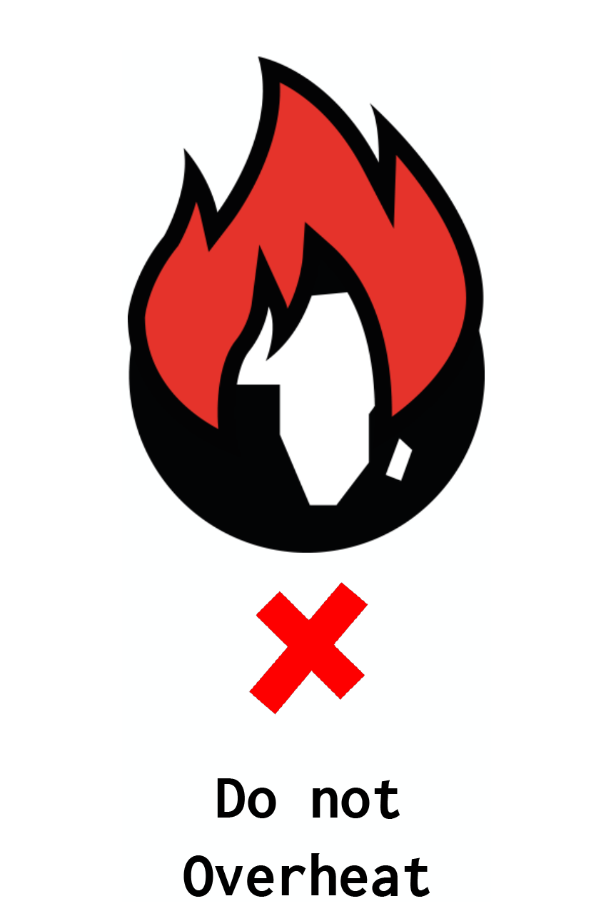
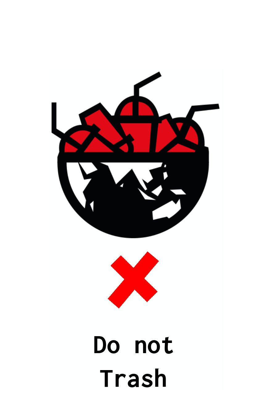
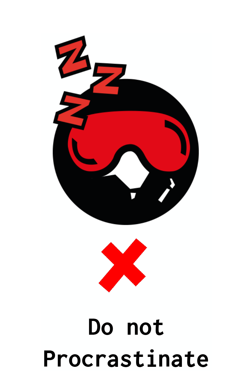
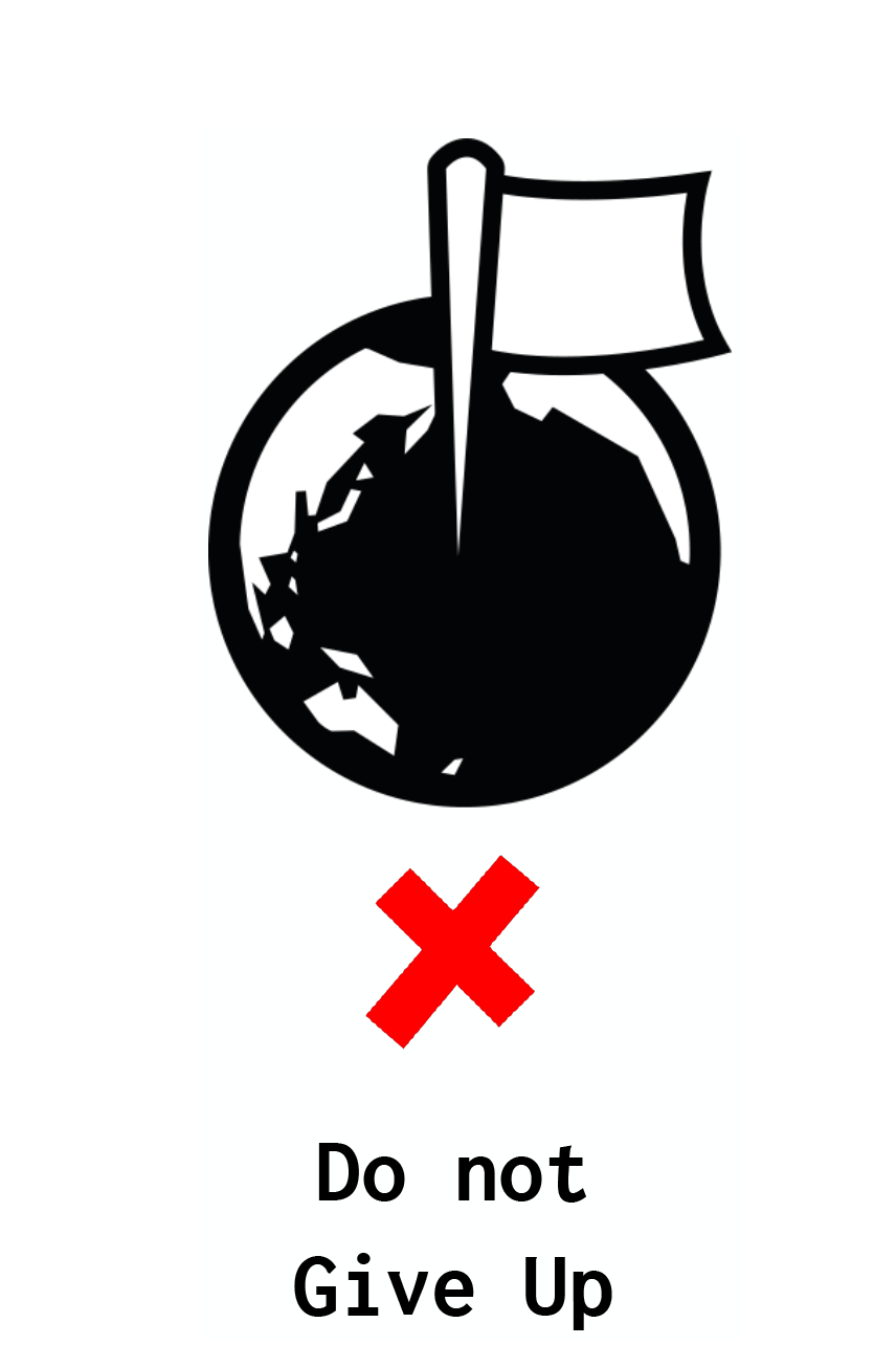
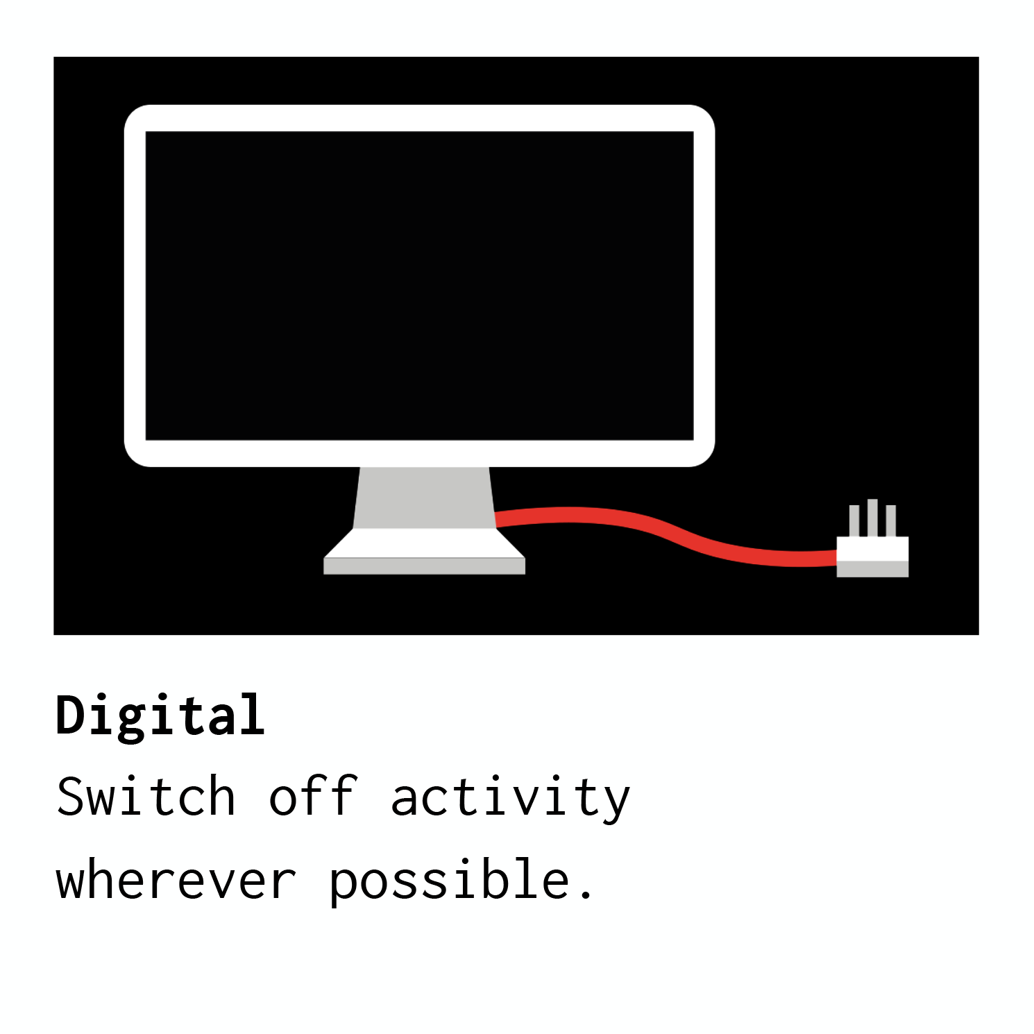
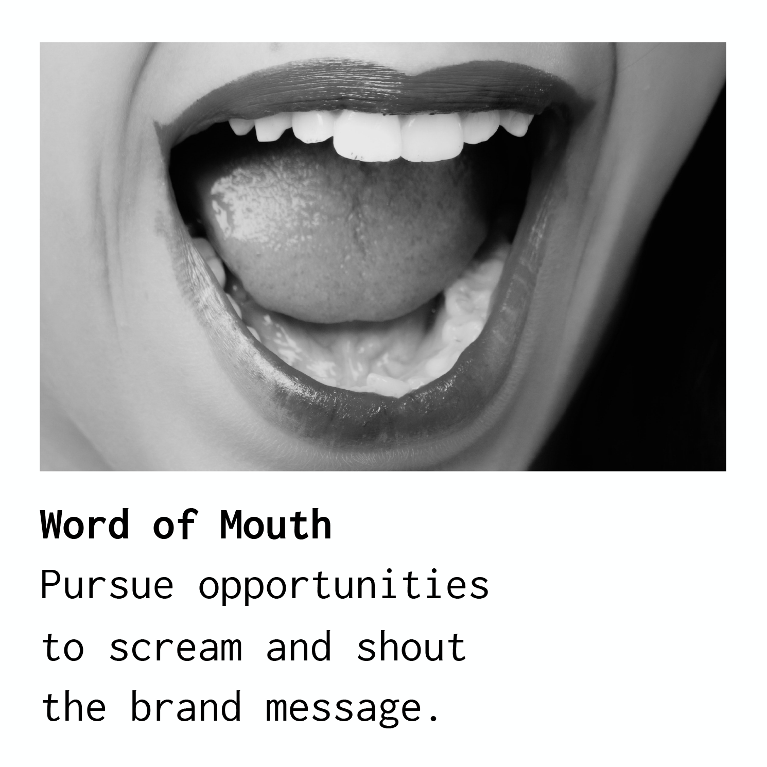
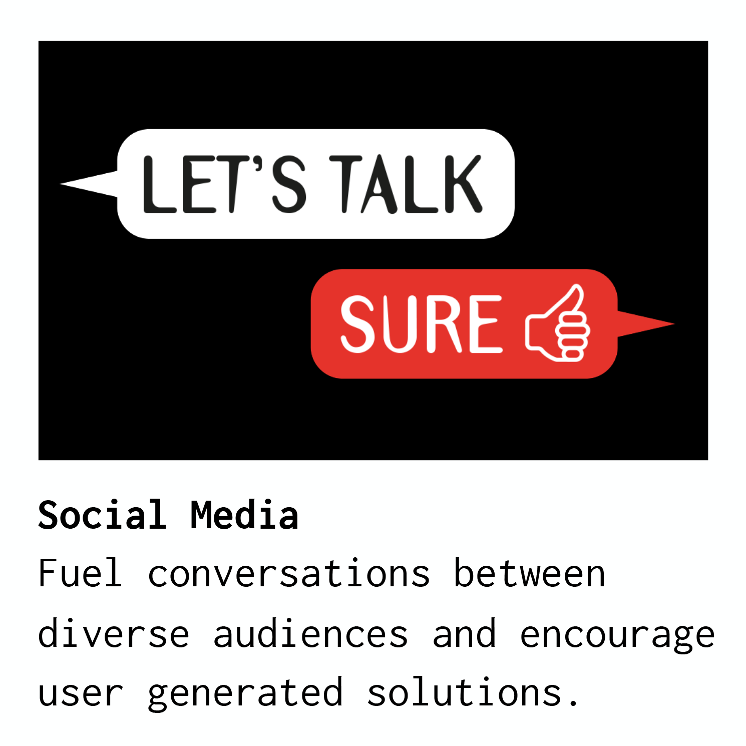
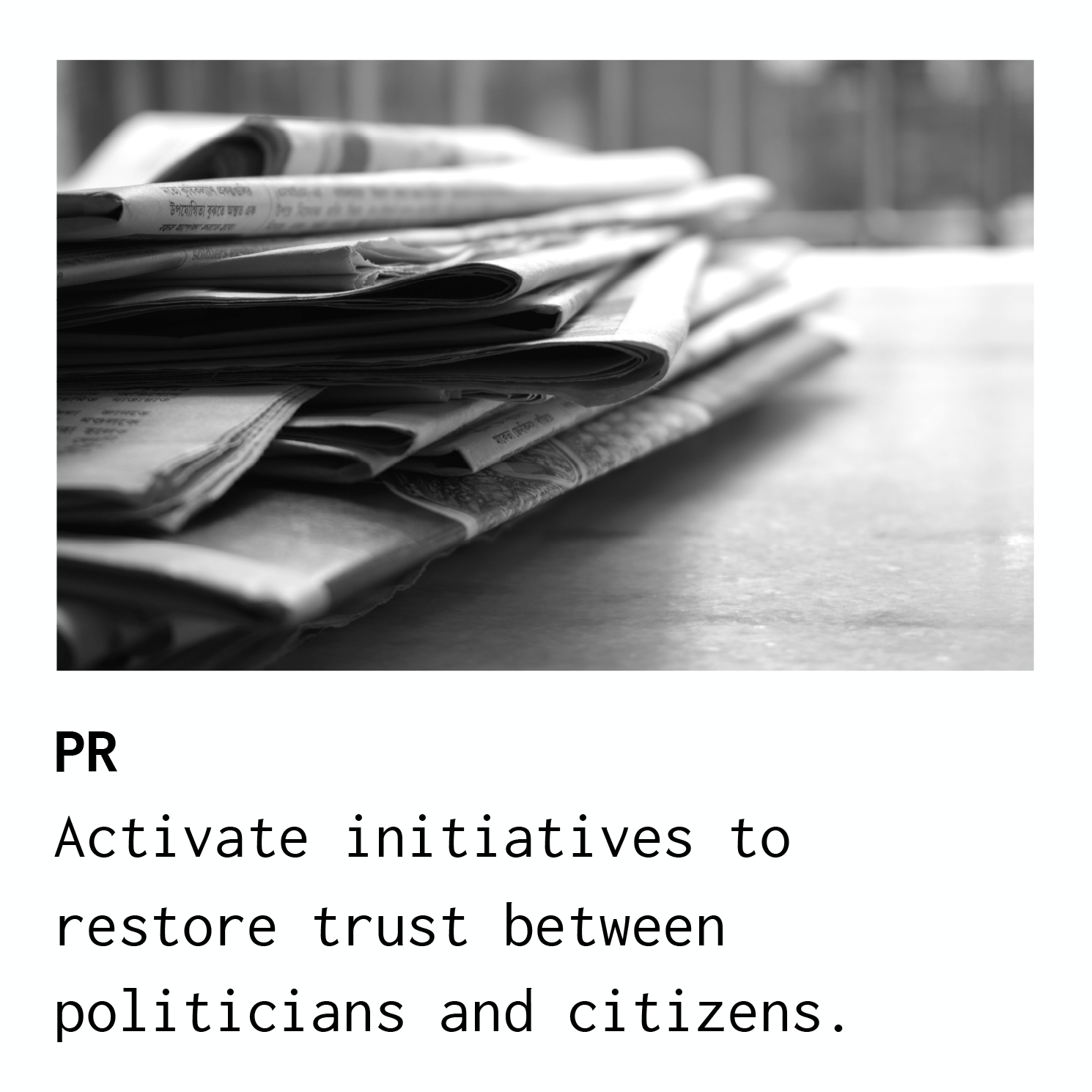
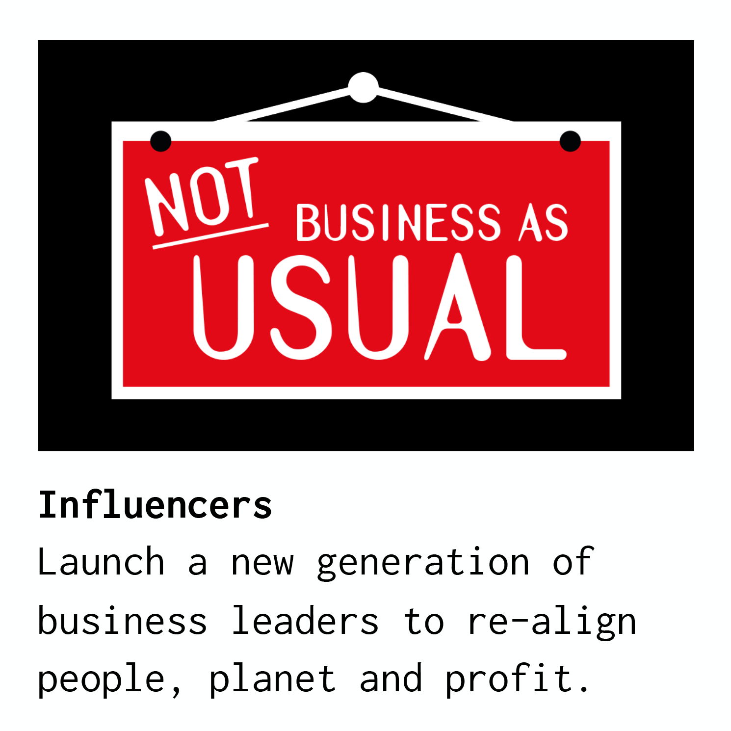
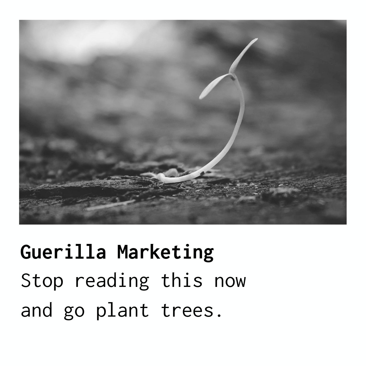
10 : BRAND ACTIVATION
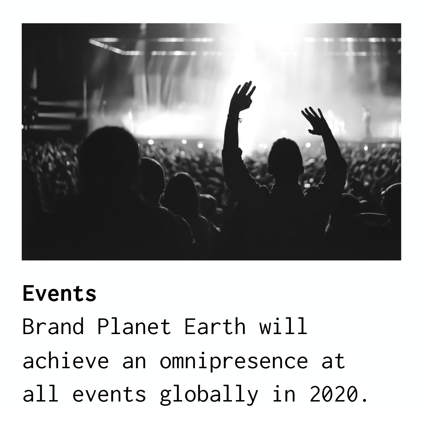
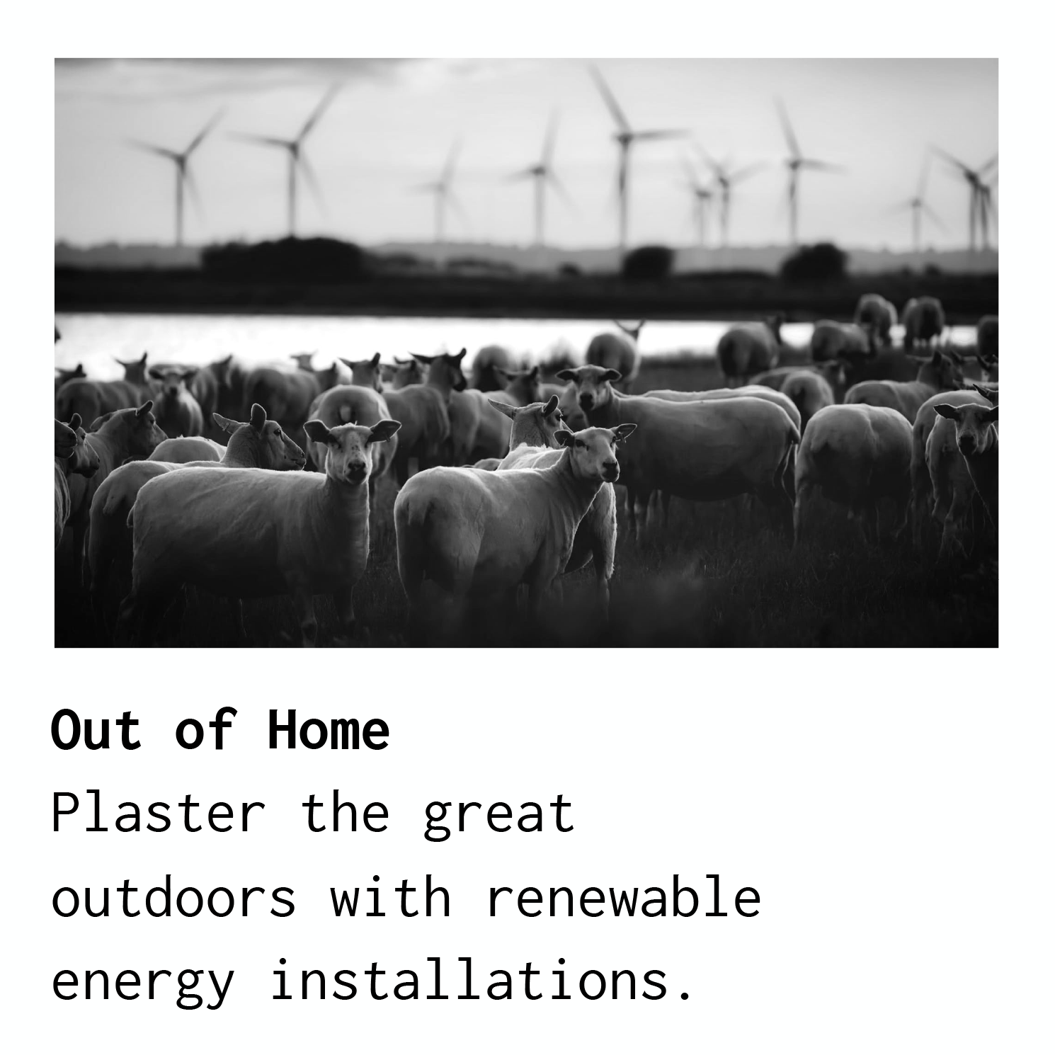
Photography from pexels.com.

ANY QUESTIONS?
Please consult your own moral compass.
